Demo Page
Markdown
Text can be bold, italic, strikethrough, and all at the same time.
There should be whitespace between paragraphs1.
Heading 1
Heading 2
Heading 3
Heading 4
Heading 5
Heading 6
This is a normal paragraph2 following a header.
😭😂🥺🤣❤️✨🙏😍🥰😊
Long, single-line code blocks should not wrap. They should horizontally scroll if they are too long. This line should be long enough to demonstrate this.
"Original content is original only for a few seconds before getting old"
Rule #21 of the internet
- Item 1
- Item 2
- Item 2.1
- Item 2.2
- Item 3
Item 4
- Perform step #1
- Proceed to step #2
- Conclude with step #3
- Milk
- Eggs
- Flour
- Coffee
- Combustible lemons
| Mare | Rating | Additional info |
|---|---|---|
| Fluttershy | Best pone | Shy and adorable |
| Apple Jack | Good pone | Honest and nice |
| Pinkie Pie | Fun pone | Parties and ADHD |
| Twilight | Main pone | Neeerd |
| Rainbow Dash | Yes | Looks badass |
| Rarity | Fancy pone | Generous |
| Derpy Hooves | M u f f i n s | [REDACTED] |
let highlight = true;
Extra
KaTeX
This Theme can render LaTeX using the KaTeX library. It can be enabled using the extra.katex config variable.
$$\relax f(x) = \int_{-\infty}^\infty\hat{f}(\xi)\,e^{2 \pi i \xi x}\,d\xi$$
$$\relax f(x) = \int_{-\infty}^\infty\hat{f}(\xi),e^{2 \pi i \xi x},d\xi$$
$\relax f(x) = \int_{-\infty}^\infty\hat{f}(\xi)\,e^{2 \pi i \xi x}\,d\xi$
$\relax f(x) = \int_{-\infty}^\infty\hat{f}(\xi),e^{2 \pi i \xi x},d\xi$
Shortcodes
This Theme provides a few useful shortcodes that simplify some tasks. They can be used on all pages.
Alerts
GitHub-style alerts. Simply wrap the text of desired alert inside the shortcode to get the desired look.
Available alert types:
note: Useful information that users should know, even when skimming content.tip: Helpful advice for doing things better or more easily.important: Key information users need to know to achieve their goal.warning: Urgent info that needs immediate user attention to avoid problems.caution: Advises about risks or negative outcomes of certain actions.
{% alert(note=true) %}
-> Alert text <-
{% end %}
Note
Useful information that users should know, even when skimming content.
Tip
Helpful advice for doing things better or more easily.
Important
Key information users need to know to achieve their goal.
Warning
Urgent info that needs immediate user attention to avoid problems.
Caution
Advises about risks or negative outcomes of certain actions.
Images and Videos
By default images and videos come with some generic styling, such as rounded corners and shadow. To fine-tune these, you can use shortcodes with different variable combinations.
Available variables are:
spoiler: Blurs image until hovered over/pressed on, useful for plot rich game screenshots.
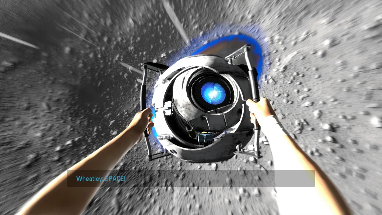
{{ image(url="image.png", alt="This is an image", spoiler=true) }}

For videos it's all the same except for a few differences: no_hover and url_min variables are not available.
Additionally, the following attributes can be set:
autoplay: Start playing the video automatically.controls: Display video controls such as volume control, seeking and pause/resume.loop: Play the video again once it ends.muted: Turn off the audio by default.playsinline: Prevent the video from playing in fullscreen by default (depends on the browser).
{{ video(url="video.webm", alt="This is a video", controls=false, autoplay=true, loop=true) }}
YouTube
Allows to embed a YouTube video using youtube-nocookie.
Available variables are:
autoplay: Whether the video should autoplay.start: On which second video should start.
{{ youtube(id="0Da8ZhKcNKQ") }}
Mastodon
Allows to embed a Mastodon post.
Available variables are:
host: The instance on which the post resides. If not set, it will fallback to the one set in the[extra.comments]section ofconfig.toml.user: The poster. If not set, it will fallback to the one set in the[extra.comments]section ofconfig.toml.id: The ID of the post, usually at the end of the URL.
{{ mastodon(host="toot.community", user="sungsphinx", id="111789185826519979") }}
Figure Captions (<figcaption>)
<figure>
  -> Whatever content <-
  <figcaption>Caption of content above</figcaption>
</figure>

Accordion (<details>)
<details>
  <summary>Accordion title</summary>
  -> Contents here <-
</details>
Reveal accordion
Get it? I know, it's an awful pun. 
Side Comment (<small>)
<small>Small, cute text that doesn't catch attention.</small>
Small, cute text that doesn't catch attention.
Abbreviation (<abbr>)
<abbr title="American Standard Code for Information Interchange">ASCII</abbr>
The ASCII art is awesome!
Aside (<aside>)
<aside>

-> Contents here <-
</aside>
A quill is a writing tool made from a moulted flight feather (preferably a primary wing-feather) of a large bird. Quills were used for writing with ink before the invention of the dip pen, the metal-nibbed pen, the fountain pen, and, eventually, the ballpoint pen.
As with the earlier reed pen (and later dip pen), a quill has no internal ink reservoir and therefore needs to periodically be dipped into an inkwell during writing. The hand-cut goose quill is rarely used as a calligraphy tool anymore because many papers are now derived from wood pulp and would quickly wear a quill down. However it is still the tool of choice for a few scribes who have noted that quills provide an unmatched sharp stroke as well as greater flexibility than a steel pen.
Keyboard Input (<kbd>)
<kbd>⌘ Command</kbd>.
To switch the keyboard layout, press ⌘ Super + Space.
Mark Text (<mark>)
<mark>Marked text</mark>
You know what? I'm gonna say some very important stuff, so important that even bold is not enough.
Deleted and Inserted Text (<del> and <ins>)
<del>Something deleted</del> <ins>Something added</ins>
Text deleted Text added
Sample Output (<samp>)
<samp>Sample Output</samp>
Sample Output
Inline Quotation (<q>)
<q>Someone said something</q>
Blah blah Inline Quote
hmm.
Unarticulated Annotation (<u>)
<u>Gmarrar mitsakes</u>
Yeet the sus drip while vibing with the TikTok fam on a cap-free boomerang.
External Links
<a class="external" href="https://example.org">External link</a>
Spoilers
<span class="spoiler">Some spoiler</span>
You know, This Theme is a pretty dumb name. I know, crazy.
Buttons Dialog
<div class="buttons">
  <a href="#top">Go to Top</a>
  <a class="colored external" href="https://example.org">Example</a>
</div>
With centered and big classes:
<div class="buttons centered">
  <button class="big colored">Do Something…</button>
</div>
Footnote

